22+ Facebook Ad Examples To Benchmark The Competition 


Winning the hearts (and wallets) of your customers can prove a long and arduous process.
That’s why it’s important to know the steps for taking your advertising from good to great.
Does this sound like you?
- Fresh to creating a Facebook page for your business, launching ads for the first time
- In and out, you’ve had a crack at running Facebook ads but results just weren’t there
- Seasoned expert having launched hundreds and thousands of ads before
- Or anywhere in between…
Then sit tight, because no matter what stage you’re at, we’ve got the answers and the inspiration for you.
Facebook is one of the strongest platforms for advertising.
It has 2.449 billion monthly active users – 1.013 billion of them in APAC alone.
But this also makes the social media platform one of the most competitive.
However, there’s no need to worry.
Getting inspiration from these following ads and knowing what generates an effective Facebook ad campaign will ensure you have the right tools to make your ad stand out from the crowd.
Let’s get to it!
22 of the best Facebook Ad examples
We know that in a highly competitive and expensive advertising landscape, the fight for attention is difficult.
So here are 22 great Facebook ad examples that we’ve compiled.
After all, in the digital age, success is all about standing out.
Best Interactive Facebook Ads Examples
These are the ads that encourage and lead your audience to engage with your post.
They help brands tell stories, enhance personalisation and they offer more data, such as what questions your audience may have engaged with and what their responses are.
Spotify
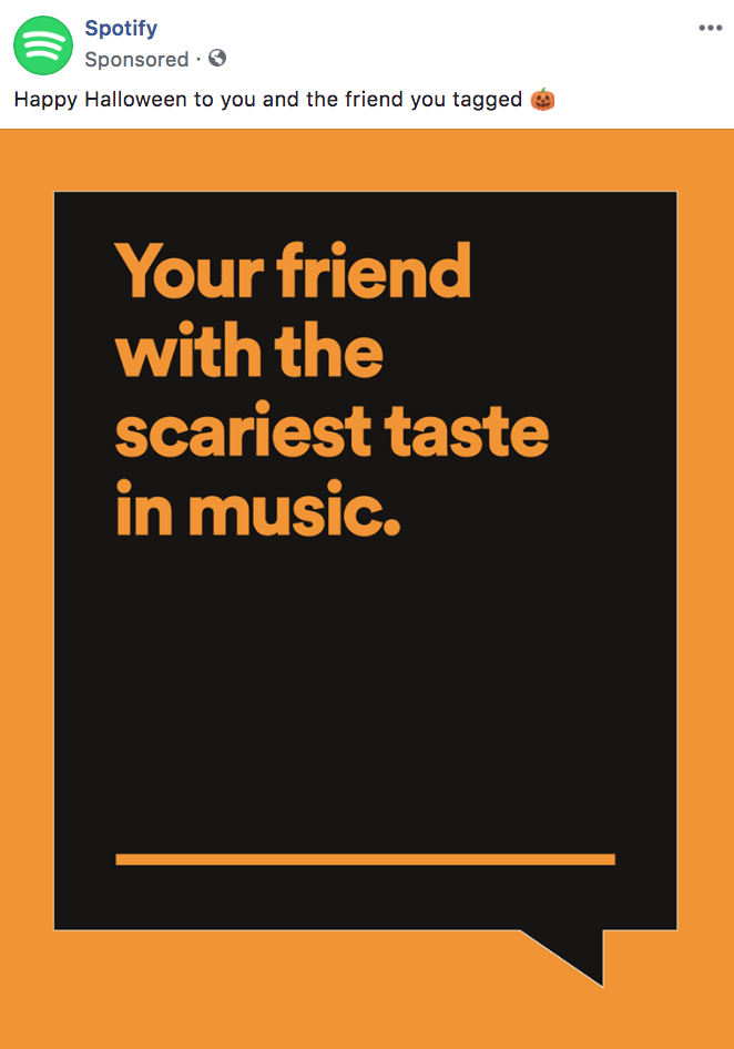
(Image Source: DigitalMarketer.com)
Encouraging your audience to tag others in your ads is a GREAT marketing tactic.
It not only engages your audience, but also increases your outreach with no extra effort or spend.
What makes this ad work: While this is an interactive campaign, it is also seasonal as it was produced around the time of Halloween.
Promotion seasonal advertisements are a great way to engage audiences.
Why?
Campaigns only run for a limited amount of time, and are also themed to the season, making them attractive.
Legendary: Game of Heroes
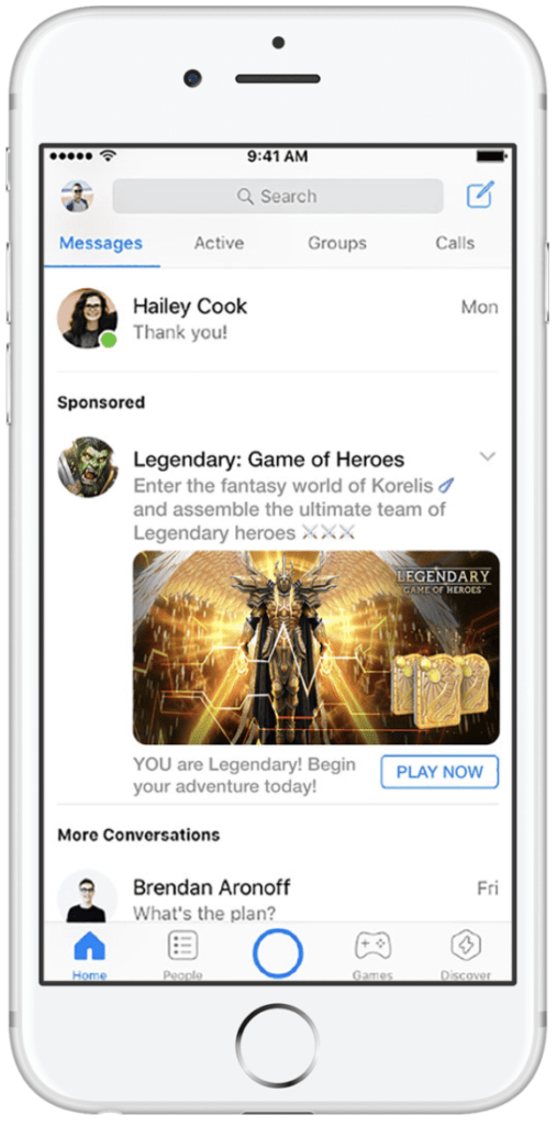
(Image Source: AdEspresso)
This unique example of interactive targeting is an effective way of increasing engagement, and conversions.
What makes this ad work:
- It is VERY apparent on the targets’ message feed. There’s no way someone’s missing that ad as it’s smack bang in the middle of the screen.
- The colors stand out. The ad is majority brown and gold, which contrast to Facebook Messenger’s blue and white theme. This makes it extremely eye catching.
- The CTA button reads ‘Play Now’. This implies the game can be played as soon as the user taps on the CTA, as opposed to the CTA ‘Download Now’, which implies that there are multi-step processes in place to play the game.
The slight difference subconsciously communicates that they won’t have to add information like their email address or credit card number to play the game. This makes it convenient and lucrative.
MobileMonkey
Gamification is basically a tool to engage your audience beyond asking questions in your Facebook Ad copy.
It can be things like quizzes, asking your audience to respond in messenger, playing basic versions of virtual games or solving questions.
Apart from engagement, it encourages loyalty and motivation to buy your product or service.
Basically, it is the idea of adding games into a non-game context.
Just check out this ad creative from MobileMonkey:
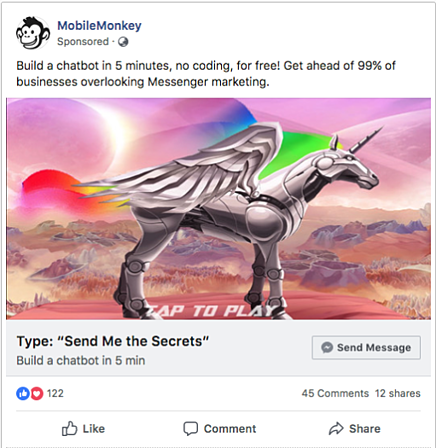
(Image Source: Facebook)
What makes this ad work: Not only is it visually exciting with the bright colors and image of the unicorn, it’s incredibly engaging.
This ad is appealing not only because of its color and its enticing copy, but also because of its gamification.
Because it asks the audience to type something in to messenger, it automatically makes the ad interactive, engaging the audience after piquing their interest through the colors and copy.
But let’s break it down even further.
Games work when there is a challenge that leads to a reward.
The challenge in this case, or the task, is typing in the phrase “Send Me the Secrets” into messenger.
The reward is receiving the secrets on building a chatbot in 5 minutes.
Simple hey?
This ad is interesting as it goes the extra mile.
It offers a technique on how to build a chatbot, and the gamification part of it is exactly like that of a chatbot.
Talk about meta marketing!
HelloFresh
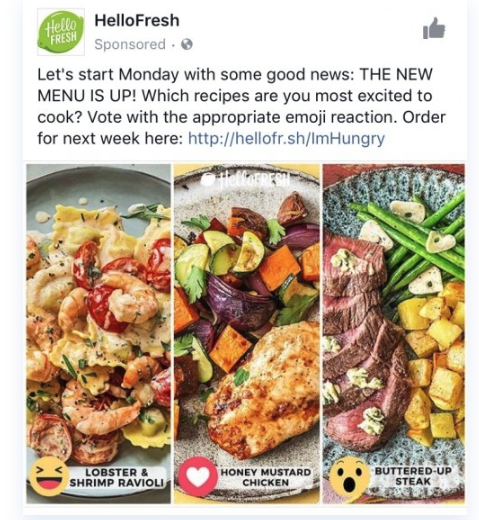
The interactive concept behind this ad is simple.
With Facebook’s year-old reaction features, marketers have grabbed the opportunity to use them for engagement.
And HelloFresh has mastered just how!
What makes this ad work: HelloFresh invites engagement from its community by asking them to vote on the recipe they’re most excited to cook. Paired with delectable photos, this Facebook Ad gets customers excited about HelloFresh’s menu and placing their orders ASAP.
Best Seasonal Facebook Ad Examples
Shopify
Black Friday is one of the biggest shopping days of the year. With tons of businesses vying for media space, Shopify had to get creative to stand out in the feed.
What makes this ad work: This Shopify ad works well as it uses a person to promote the business’ service.
This establishes a human connection, as your customer feels they are being spoken to by another person, not a business.
It creates a sense of urgency by dropping in the Black Friday Sale.
Target
Another Black Friday ad!
Cyber Weekend is typically when brands pull out all the stops for advertising, so it’s no surprise that this is when Target chose to create a bold ad that piqued customer curiosity.
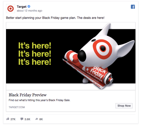
(Image Source: Adespresso)
What makes this ad work: Target reels audiences in with its stand out visuals and copy
By asking ‘it’s here’ three times, audiences have no choice but to question ‘What’s here?’
The dog’s eye as the Target symbol works really well too – on a brand awareness level, customers will not forget the company that created the ad.
Best Testimonial Facebook Ad Examples
This ad type is pretty self-explanatory.
The marketing tactic is to use external validation and reviews to boost a product or service.
Check out these examples below.
Singapore Airlines
Singapore Airlines has long been considered one of the best airlines in the world. And for those who might be tossing up between SQ and one of its competitors, this testimonial ad may just be enough to steer them in the right direction.

What makes this ad work: This ad works well as it is pitching itself with awards won, AND also adding client testimonials. Coupled with the brand’s iconic “Singapore Girl”, this ad helps build up Singapore Airlines’ brand awareness amongst customers, even if they aren’t planning a trip just yet.
Best Facebook Ad Examples: Scarcity, or fear of missing out (FOMO)
Before we dig deep into some great Facebook ad campaigns, let’s look at the psychology behind FOMO.
It is described as the “fear of making the wrong decision – the one that will leave you feeling like you’re missing out on what could have been.” (i-D)
This is why consumers get FOMO.
And it’s a perfect opportunity to leverage fear-based marketing tactics.
Let’s have a look at some good ones.
Sydney Theatre Company
This ad from Sydney Theatre Company is the perfect example of hyper-targeted FOMO marketing at its finest. It promotes special rates for under 25s for its production, COSI, which can be redeemed using a special code on its website.
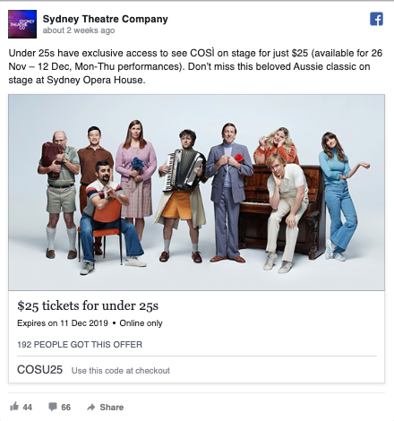
(Image Source: Facebook)
What makes this ad work:
- It creates the feeling of FOMO. If you don’t use this coupon by 11 December 2019, it will expire, and you will not be able to get $25 tickets anytime after
- It uses repetition. $25 tickets for under 25s sticks in your mind.
- It targets a very specific demographic. Under 25s usually cannot afford pricey theatre tickets, so by having a cheaper deal targeted to a demographic who is most likely to benefit from it, the ad hits the mark
- Showing demand. Right under the description it shows “192 people got this offer.” This is social proof the advertisement is both legitimate, and popular.
The New Yorker
(Source: Facebook)
Everyone’s paying for a media subscription these days, which is why an offer needs to stand out if a brand wants to gain new customers. That’s exactly what the Nw Yorker did with this Facebook video.
What makes this ad work: This ad works well as it gives two offers in one ad: A cheap subscription to the New Yorker magazine, along with a free tote bag. Two birds with one stone!
Best Emotional Facebook Ad Examples
Nike
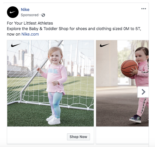
Immediately, Nike has your hearts with this canvas ad.
Even if you’re not a parent after sportswear for your bub, this ad is appealing to a wider audience – i.e. anyone who finds babies doing adult things cute.
This is smart advertising, as it works on two levels.
What makes this ad work: It not only appeals to the audience through its cuteness, but also leaves the audience wanting more – and delivers that through the carousel.
The promise of more cute baby photos doing athletics is likely enough to get a parent to swipe through.
And boom – Nike has achieved their objective of getting their target demographic to engage with their ad.
Carousel ads work really well when there are multiple photos and products you as a marketer want to display.
Note as well how simple this ad is. With concise copy, a couple of photos and a clear call to action button, it became one of Nike’s best performing ads.
Promo
(Image Source: Facebook)
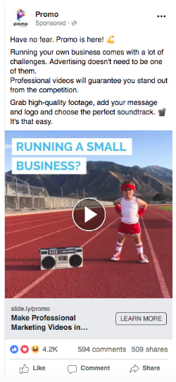
Consider the idea behind the video.
It’s simple, appeals to the target audience (small businesses) and uses clever copy and a good idea to deliver its message.
So much so in fact, that it received 4.6k likes and over 600 comments!
What makes this ad work: The humour element of this ad also means it is more likely to stick in the audiences’ minds.
However, as strong as this ad is, there is one downfall.
Notice how the headline truncates after the first five words?
A more effective headline would be one that is concise enough to fit within the specs of that advertisement.
Best GIF and Video Facebook Ad Examples
Best Buy
(Image Source: DigitalMarketer.com)
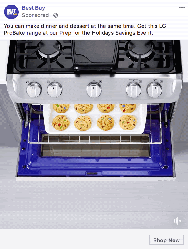
Although Best Buy is an American brand, this motion-based ad speaks to consumers around the world thanks to its eye-catching simplicity. By pairing great Facebook Ads with a great offer, Best Buy’s ad is an enticing call to action for shoppers to get in and pick up this oven at a discount.
What makes this ad work: This ad works well on a range of levels.
It is colorful, and the simple movement draws the user’s eye, even in a cluttered user’s Facebook news feed. Plus, the combination of simultaneously baking cookies and pizza in the oven at the same time is designed to intrigue shoppers and make them ask “how is this possible?”
At the same time, the copy creates a sense of urgency (Prep for the Holiday Savings event), while also promoting an event the company is hosting!
Purple
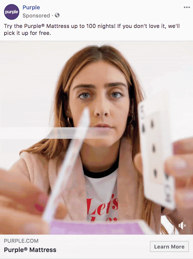
There are so many bed-in-a-box brands out there today, so you really need to do something different if you want to hook customers in and get them excited about your product. And that’s precisely what Purple has done with this video promoting their motion isolation technology.
(Image Source: DigitalMarketer.com)
What makes this ad work: This ad works well as, like the HelloFresh ad format, it works on two sides of the screen.
It promotes the product with a video less than 10 seconds, but shows exactly how well the product works.
The copy also guarantees a trial period and a free return in the case of customer dissatisfaction.
This benefits customers, and so is highly appealing.
Accenture
As a professional services company, Accenture creates value for clients with their consulting and project management offerings. While most other B2B companies may advertise exclusively on LinkedIn, Accenture uses Facebook to build awareness and reach working professionals on a channel that their competitors may have overlooked.

(Image Source: Hubspot)
What makes this ad work: This ad takes the meaning of ‘threats’ quite literally.
By synchronising the copy and the video, that ad comes across as cohesive, engaging and credible (one of the very important copywriting Cs!)
DropBox
This fun, short video (falling within 30 seconds) shows the audience exactly how to use DropBox Spaces. The ad includes real footage from Dropbox, along with a voiceover explaining the different features of the platform.
What makes this ad work: There’s nothing more enticing than marketing that tells the audience exactly what it is selling. After watching this ad, users know precisely what’s in store if they sign up for Dropbox — which means those that do click on the ad are likely to be highly qualified site visitors.
HelloFresh
Here’s another great video ad from HelloFresh. This time, the food delivery service is promoting its ready-to-cook boxes, along with an enticing offer for new subscribers to get 40% off their first box.
What makes this ad work: This ad works really well as it is multilayered – playing two videos in one.
These videos correspond with each other, which is what ties the ad together.
As there is a lot happening on the screen, the viewer is forced to concentrate slightly harder to understand what is happening, which in turn increases their engagement.
It is visual, simple and colorful.
Best Facebook Ad Examples: Other Ads
Nespresso
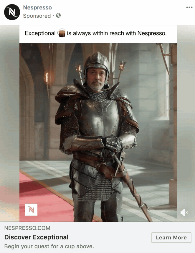
Nespresso is known for its elaborate store displays, but this Facebook ad takes the brand’s creativity to a whole new level. By creating a Facebook video masquerading as a Facebook post, Nespresso surprises and delights audiences with an unexpected take on the traditional newsfeed ad.
(Image Source: DigitalMarketer.com)
What makes this ad work: The copy seeps into the video, which creates excitement for the customer because it is unexpected.
The copy is also clever, as the video responds to it in a quite literal way.
The medieval theme also creates a feeling of adventure, which ads to the appeal and the sense of excitement.
By doing this, your audience is more likely to pause scrolling their news feeds to watch the ad as they understand what is happening in it.
Boom! You’ve got their attention.
Pura Vida Bracelets
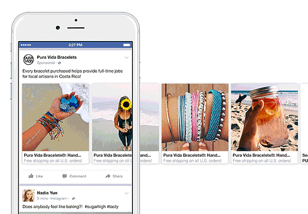
Since Facebook launched carousel ads more than half a decade ago, brands have been using this format to engage audiences and encourage them to explore their products and services.
Pura Vida Bracelets’ Facebook ad is a prime example of how combining the carousel format with user-generated content (UGC) can make shoppers stop scrolling and start discovering.
(Image Source: Sprout Social)
What makes this ad work: This stunning carousel ad works well as showcases the product in the first slide, but then goes on to showcasing more elements and behaviours that are associated with the product.
It is colorful, and doesn’t just sell the product – but the lifestyle too.
Subconsciously, this ad tells customers that by purchasing these bracelets, they will have access to a beachy, carefree and sunny lifestyle.
Shopify
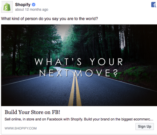
Let’s have a look at this Facebook ad image from Shopify. As one of the world’s biggest eCommerce platforms, Shopify helps millions realise their dream of promoting their products online.
(Image Source: Pinterest)
What makes this ad work: This ad immediately sticks out because of its simplicity.
But it also compels the audience as it immediately draws their eyes to the center of the ad’s image using the dark and lightness contrast.
Simple, yet effective.
As Google puts it: “Straightforward messages deliver results.”
Ladder
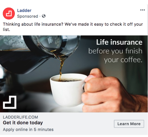
Insurance is one of those things that everyone knows they should get, but keep putting off. With this ad from the Facebook Ad library, Ladder speaks to this experience by telling users they can tick insurance off their list in just a few minutes.
(Image Source: DigitalMarketer.com)
What makes this ad work: This ad creates a comparison to show how quickly the service delivers.
Making coffee doesn’t take long, so the promise of being able to complete a life insurance plan before finishing coffee is lucrative.
BookClub
Sometimes, there’s nothing more daunting than making a decision — especially when it comes to the next book you’re going to read.
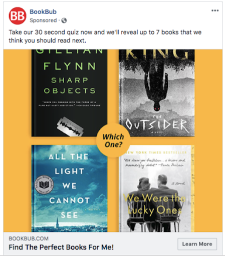
BookBub’s ad makes it easy for audiences by deciding their book for them!
(Image Source: HubSpot)
What makes this ad work: BookBub’s ad promises users that they can get 7 book recommendations that are tailored to their reading tastes — in just 30 seconds. This low barrier to entry is more than enough reason to make users want to click through, find new books and hopefully make a purchase in the process.
On top of that, it lays out four book covers against a bright yellow background to really make the ad pop in the feed.
NatureBox
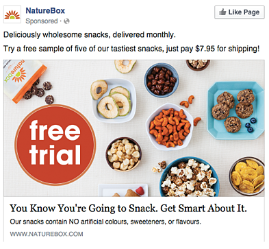
NatureBox’s Facebook ad speaks to something that most of us love to do: snack. With delicious healthy snacks delivered every month, NatureBox’s subscription service is appetising in and of itself — and this ad is just the icing on the cake.
(Image Source: HubSpot)
What makes this ad work: Immediately by looking at this desktop news feed ad, you know what it sells.
The ad visuals are appealing and the food looks fresh and appetising.
Plus, the huge free trial copy is emphasized, while fitting in with the overall color scheme of the ad.
What Facebook ad types are most effective?
The most effective Facebook ad type depends on your industry, audience, and your objectives.
There are eight different Facebook ad formats you can choose from for your Facebook Advertising campaign, each catering to the specific goals you want your ad to accomplish. Knowing when and how to use each of these is critical if you want to build high-performing campaigns that deliver tangible results for your business.
Photo ad
Photo ads use crisp images to promote a product or event. These ads are best if you have really powerful imagery and you want to use it to make a big impact on the Facebook feed.
Photo ads suit companies with highly visual products, such as travel, food and lifestyle. For ads shown in a Facebook News Feed, the recommended image resolution is at least 1080 X 1080.
Video ad
Video ads have a GIF or video as the centerpiece of the advertisement, and are often used to demonstrate a product or event. There are six types of video ads you can invest in on Facebook:
- Short videos and GIFs
- Vertical videos
- Instagram stories
- Video carousels
- Video collections
- In-stream videos
If you have great video content, a video ad is the best way to engage your audience and increase conversions. According to HubSpot, video is the second most popular type of social media content that’s used to increase audience engagement — and companies that use video increase revenue a whopping 49% faster than those who don’t.
Stories ad
Stories ads are a part of Facebook Stories, which allows users to post temporary clips and images of their day for their friends to see. This type of ad can be played on mobile and desktop, and usually appears inside a stream of Stories.
Stories ads are effective if you want to reach your audience in different places. They can be placed on Facebook, Messenger, and Instagram, so you’ll be able to maximize the reach of your content.
Messenger ad
A Messenger ad appears as a direct message in a user’s message list when they’re inside Facebook’s Messenger app. These ads allow you to interact with your audience, thus enabling you to show additional ads specifically tailored to their interests.
According to Facebook, Messenger ads are most effective when you reach people at scale, then follow that up by interacting with them individually. This might be sending a promotion to existing customers, extending a welcome back offer to unhappy customers, or letting your audience know about a new product or service.
Carousel ad
Carousel ads contain a series of images or videos that users can rotate through. Each carousel ad can contain up to 10 images or videos helping to describe a single product, service, or event the ad is promoting.
Carousels are most effective if you want to:
- Endorsing multiple products
- Promoting multiple features of the same product
- Telling a story or sequence of events
- Explaining a process to potential customers
Slideshow ad
Slideshow ads segment your ad into individual images that users view one after another. Unlike carousel, slideshow ads only play images (not videos), and the ad compiles these images into a slideshow that plays automatically like a video. Slideshow ads are effective for:
- Creating a video-like experience with a small budget
- Simplifying an otherwise complicated concept or process for potential customers
- Reaching people who have slower internet connections
Collection ad
Collection ads bring the buying process directly to Facebook, so potential customers can move from “discovery” to “purchase” more easily. These ads feature a central image or video promoting a product, with a collection of added images that viewers can click on to learn more.
There are four types of collection ads:
- Instant storefront. This ad is ideal for displaying multiple products as part of one campaign.
- Instant outlook. This ad is ideal for modelling a product in various contexts for your audience.
- Instant customer acquisition. This ad is ideal for driving traffic to a product’s landing page and prompting action.
- Instant storytelling. This ad is ideal for telling a story about your brand.
If you’re selling products online and your advertising goal is to increase sales, Collection ads are a powerful way to do just that.
Playables
Catered specifically to app developers, playables allow your audience to watch and preview a new app from directly inside the ad. These are effective for racking up downloads for a platform and increasing your user base.
How do I make a good Facebook ad?
To invest in Facebook ads effectively, you need to know how to create an ad that will be successful with your target audience.
The best Facebook ads campaigns come in all formats, but they have three things in common: they’re targeted, they combine powerful copy and content, and they’re tested and refined over multiple split tests.
If you want to make a revenue-shifting Facebook ad, follow these five steps.
1. Start with a goal in mind
Every success story starts with a plan.
This is why starting with a concrete step-by-step list of what you want to achieve is the right way to go.
Consider what you want. Is it:
- More conversions. More people buying into your business? Yes, please!
- Easier lead generation: Are you getting a lot of engagement but finding your customers aren’t showing a lot of interest after reaching landing pages?
- Increased website traffic. Whether it’s attracting timely visitors for product promotions, to building awareness through educational content amplification, traffic is the ticket for most businesses. Imagine spending $3k on your ad budget, only to sell products worth $150. These ad examples will show you how to market for better ROI.
- More purchases. With smart targeting, you can drive both new AND repeat purchases for loyal customers
- Decreasing the number of abandoned shopping carts. This can be done by targeting people who’ve recently viewed product pages.
Once you have this, you can tailor your ad to achieve your goals with targeting, content, and copy.
2. Target the right audience
Well, it’s important your ad is targeted to the correct audience.
This relies on analysing data. So let’s consider the following factors:
- Location
- Age
- Interests
- Gender
- Marital and family status
- Career path
- Return or first-time customer or visitor
- Mobile, tablet or desktop visitor
- Company size re revenue and employees (if your audience are businesses)
- Industry of work
- Social network platform used most
- General interests
- Professional skills
- What type of content they consume
- Shopping preferences (whether they interact with vendors over the phone or in person
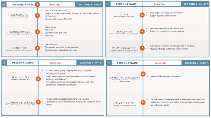
With these demographic, professional and personal factors in mind, you can build a persona. I.E. a semi-fictionalised representation of a specific customer group.
Here’s a great example persona from HubSpot:
(Image Source: HubSpot)
From your persona, you can craft your ad.
Facebook, unlike any other platform, has a comprehensive targeting system which means you can choose who sees your ads.
Cool, hey!
But what if you’re a brand that wants multiple audiences to see your ads because of the products and services you offer?
Well, that’s awesome!
You can use Facebook to your advantage by creating separate ads too.
Let’s say you’re in charge of marketing for a tech store selling everything from laptops, hard drives to security systems.
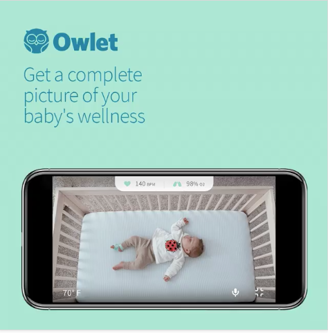
Your target persona is a first-time mother in her 30s with a young baby.
Knowing this, you can target your baby monitoring system.
You also have a second target audience – university students looking to invest in a new laptop.
You create an ad that is appealing to someone in their late teens or early 20s.
Think about the copy, the images, the design you would have for each.
And consider the pain points.
The mother’s biggest concern is often safety – so your ad should emphasize that your product will keep her baby safe.
Like with this ad:
(Image Source: Owlet Facebook)
On the other hand, the university students’ biggest priority is likely cost and features.
If you were to target these ads to the opposite demographic, they wouldn’t work so well.
It’s important to create personas so you can target your audience as accurately as possible.
Targeting based off demographics like gender, ethnicity, location, age, sex and interests will ensure when you put out your ad, it hits the right audience goal.
Once you’ve got this covered, it’ll be easier to nail the tone of your ad.
3. Select the right media
A powerful Facebook ad also sticks in your customers’ minds.
One way this can happen is through content.
Content takes up a massive part of your ad. It’s the part that gets people to pause and pay attention to what you have to say, read your copy, and even click through to your website.
Whether it’s photos, videos, GIFs or links, you can’t afford to just throw in any old image. You have to put careful thought into it if you want to get the best results from your ad.
Here’s a great example from Headspace. The meditation app is known for helping users focus and gain calm and clarity, which is why this video works so well. Even with the sound off, Headspace speaks to feelings of anxiety and stress — and positions its app as the solution.
Imagery can be JUST as effective as video.
Take a look at this one from Nike promoting its new Nike Air Zoom sneaker:
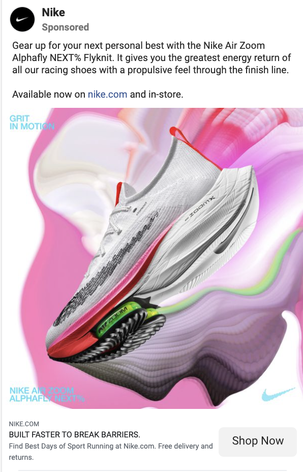
The vibrant colors make the ad pop and grab the user’s attention, before directing them to discover more on the Nike website.
4. Ad copy is king
As a marketer, writing is the backbone of your resource pool.
And good copywriting will appeal to Facebook users on a practical and emotional level.
Like the visual design, copy also works when it’s delivered in threes.
Here are some tried and tested formulas to get you started on writing the strongest ad text around.
A. BAB
Before – Here’s what your world was like while the problem was still in it. Identify the customer’s pain point.
After – Here’s what your world will be after the problem/pain point is resolved.
Bridge – Here’s how we can get you there.
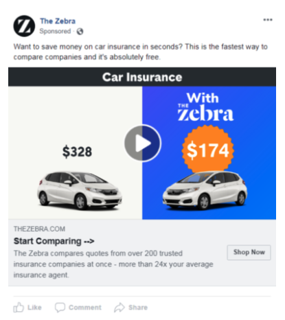
(Image Source: The Zebra)
Let’s break it down:
Before – The pain point: the customer has spent A LOT of money and time on car insurance. “Want to save money on car insurance in seconds?”
After – The customer can easily get cheap and quick insurance, and can spend those hard-earned dollars elsewhere. “This is the fastest way to compare companies and it’s absolutely free.”
Bridge – The customer can compare “Start comparing.”
B. The four C’s formula.
Clear, concise, compelling, credible.
Why does it matter?
Well, the point of an ad is to get your point across.
So, how does it work with this ad?
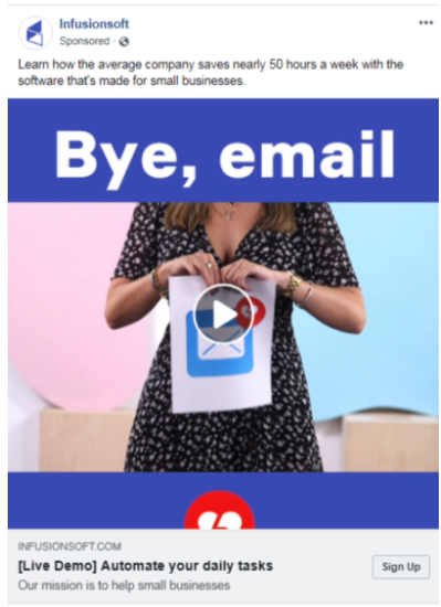
(Image Source: Proof)
Clear – Software that makes emailing easier for small businesses.
Concise – The description is only one sentence.
Compelling – A brightly colored video stands out from the crowd.
Credible – Offers a live demo so customers can see what they are signing up to.
C. SSS formula
This stands for Star – Story – Solution.
Let’s consider this ad from Grammarly.
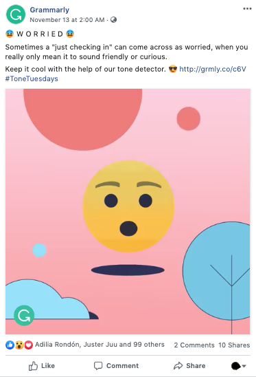
This is a killer ad as it uses great branding, standout colors, and eye-catching emojis.
When it comes to copy – it nails what the audience is after.
Star – Professionals want to come across as confident, not naggy or aggressive.
Story – Not knowing how to amend their tone means they come across as “worried”, which leads to awkward office interactions.
Solution – You download Grammarly’s tone detector to avoid sounding worried, and develop a better relationship with your colleagues and professional network.
D. The {Product Name} is a {product category} that {different thing it does best} formula
This is one of the most basic of Facebook ad copywriting formulas, yet is highly effective.
Why?
Because it is straightforward.
After reading the formula, the customer knows exactly what the product or service is, and why the business is promoting it.
Here’s an example:
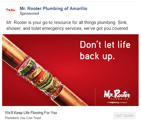
(Image Source: Webfx)
This ad applies this formula perfectly.
Let’s break it down!
“Mr Rooter is your go-to resource for all things plumbing. Sink, shower and toilet emergency services, we’ve got you covered.”
It hits all three elements of the formula, AND also has clever copy overlaid on the image – which is both graphic and visualises the customer’s pain point (clogged pipes).
Other great tools to take your copy from good to great are headline analyzers!
They reveal how clearly and how emotive your headline reads to users.
Some really great resources are ones from CoSchedule and AMI.
And the best part?
They’re free!
5. Test one element at a time
A/B testing in Facebook ads (or multivariate/split testing) is incredibly important.

It’s basically testing two of the same ads against each other with one differing element.
Remember high school science experiments?
You tested how quickly something would melt by putting it over a Bunsen burner.
The only factor you changed is what element you were testing.
The rest remained the same.
That’s what split testing does.
You run one standard ad – but create multiple various versions, changing one thing in each version.
This could either be the image used, the copy, the gamification feature, the colors used or a whole host of things.
Here’s one example:
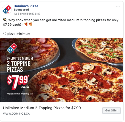
(Image source: Facebook)
These ads are almost identical – they have the same copy, same CTA button, same value deal and same headline.
However, the images are slightly different.
As you can see, the first image has just one pizza with the copy on the right-hand side.
The second has three pizzas with the copy on the left-hand side.
This is A/B testing at its most basic form.
The ad variation that performs better will be recirculated.
Let’s have a look at another example.
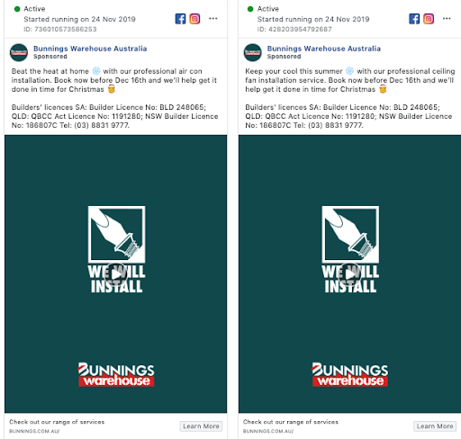
(Image Source: Facebook)
Can you pick out the differences between them?
They are ALMOST identical!
The only difference is the first line of the copy.
The first ad reads ‘Beat the heat at home’, while the second ad reads ‘Keep your cool this summer.’
Though these aren’t major differences, they are still valuable to A/B test as the ad that performs better will tell the business whether their audience prefers negative language (the first example), or positive language (second example).
Over to you
Writing a Facebook ad isn’t as easy as waving a magic wand, but it isn’t as difficult as Romeo trying to win over Juliet.
With this guide, I hope you see how these ads show what effective advertising is, and you feel empowered to go out and conquer advertising on Facebook.
Which type of ad you choose will highly depend on your budget, your brand, your target audience and their Facebook using behaviours.
This toolbelt offers you how to write effective ad copy, why simplicity delivers and a step-by-step process on creating appealing Facebook ads.
Inspiration can strike at any second – so make sure to have a look at these examples to see how you can create your next high-quality Facebook ad.
Still craving for more? Check out our Digital Marketing Game Plan. Available to you, for free!

